
Very interesting observations taken again from the blog DarkHorse Analytics on presenting graphs. Consider!
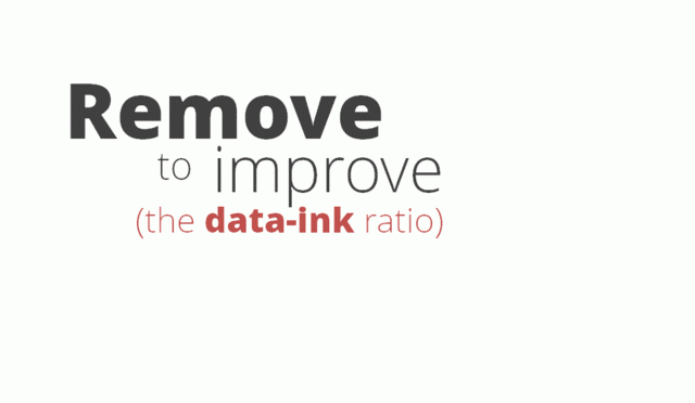
To illustrate how less ink is more effective, attractive and impactive we put together this animated gif. In it we start with a chart, similar to what we’ve seen in many presentations, and vastly improve it with progressive deletions and no additions.
Curated from darkhorseanalytics.com
Add your annotation